
Cells are the backbone of the Eto Grid types, GridView and TreeGridView, two very extensible and powerful containers in Eto.
TextBox Cell API
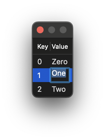
TextBoxCells can be used for displaying text or creating editable text.
As long as Editable is set to true, the text can be changed and will update the source.
using System.Collections.ObjectModel;
using System.Collections.Generic;

using Eto.Forms;

var items = new ObservableCollection<object>();
items.Add(new List<object> () { 0, "Zero"});
items.Add(new List<object> () { 1, "One" });
items.Add(new List<object> () { 2, "Two" });

var dialog = new Dialog()
{
  Content = new GridView()
  {
    Columns = {
      new GridColumn()
      {
        HeaderText = "Key",
        DataCell = new TextBoxCell(0),
      },
      new GridColumn()
      {
        HeaderText = "Value",
        DataCell = new TextBoxCell(1),
      },
    },
    DataStore = items
  },
};

var parent = RhinoEtoApp.MainWindowForDocument(__rhino_doc__);
dialog.ShowModal(parent);
from System.Collections.ObjectModel import ObservableCollection

import Eto.Forms as ef

items = ObservableCollection[object]()
items.Add([0, "Zero"])
items.Add([1, "One"])
items.Add([2, "Two"])

key_column = ef.GridColumn()
key_column.HeaderText = "Key"
key_column.DataCell = ef.TextBoxCell(0)

value_column = ef.GridColumn()
value_column.HeaderText = "Value"
value_column.Editable = True
value_column.DataCell = ef.TextBoxCell(1)

gridView = ef.GridView()
gridView.DataStore = items
gridView.Columns.Add(key_column)
gridView.Columns.Add(value_column)

dialog = ef.Dialog()
dialog.Content = gridView

dialog.ShowModal()
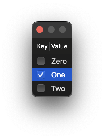
CheckBox Cell API
CheckBoxCells are toggle-able, as long as Editable is set to true, the box can be toggled on and off which will update the source.
using System.Collections.ObjectModel;
using System.Collections.Generic;

using Eto.Forms;

var items = new ObservableCollection<object>();
items.Add(new List<object> () { false, "Zero"});
items.Add(new List<object> () { true, "One" });
items.Add(new List<object> () { false, "Two" });

var dialog = new Dialog()
{
  Content = new GridView()
  {
    Columns = {
      new GridColumn()
      {
        HeaderText = "Key",
        Editable = true,
        DataCell = new CheckBoxCell(0),
      },
      new GridColumn()
      {
        HeaderText = "Value",
        DataCell = new TextBoxCell(1),
      },
    },
    DataStore = items
  },
};

var parent = RhinoEtoApp.MainWindowForDocument(__rhino_doc__);
dialog.Show(parent);
from System.Collections.ObjectModel import ObservableCollection

import Eto.Forms as ef

items = ObservableCollection[object]()
items.Add([False, "Zero"])
items.Add([True, "One"])
items.Add([False, "Two"])

key_column = ef.GridColumn()
key_column.HeaderText = "Key"
key_column.Editable = True
key_column.DataCell = ef.CheckBoxCell(0)

value_column = ef.GridColumn()
value_column.HeaderText = "Value"
value_column.DataCell = ef.TextBoxCell(1)

gridView = ef.GridView()
gridView.DataStore = items
gridView.Columns.Add(key_column)
gridView.Columns.Add(value_column)

dialog = ef.Dialog()
dialog.Content = gridView

dialog.ShowModal()
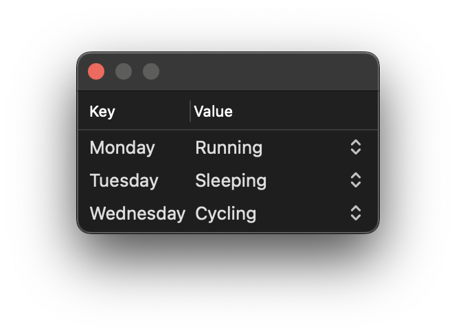
ComboBoxCell Cell API
ComboBoxCell contain collections of items, as long as Editable is set to true, the combo box can be chosen from which will update the source.
using System.Collections.ObjectModel;
using System.Collections.Generic;

using Eto.Forms;

var activities = new List<object>
{
  "Running", "Sleeping", "Cycling", "Gardening"
};

var items = new ObservableCollection<object>()
{
  new List<object> () { "Monday", activities[0] },
  new List<object> () { "Tuesday", activities[1] },
  new List<object> () { "Wednesday", activities[2] }
}

var dialog = new Dialog()
{
  Content = new GridView()
  {
    Columns = {
      new GridColumn()
      {
        HeaderText = "Day",
        DataCell = new TextBoxCell(0),
      },
      new GridColumn()
      {
        HeaderText = "Activity",
        Editable = true,
        DataCell = new ComboBoxCell(1)
        {
            DataStore = activities
        }
      },
    },
    DataStore = items
  },
};

var parent = RhinoEtoApp.MainWindowForDocument(__rhino_doc__);
dialog.Show(parent);
from System.Collections.ObjectModel import ObservableCollection

import Eto.Forms as ef

activities = [ "Running", "Sleeping", "Cycling", "Gardening" ]

items = ObservableCollection[object]()
items.Add(["Monday", activities[0]])
items.Add(["Tuesday", activities[1]])
items.Add(["Wednesday", activities[2]])

key_column = ef.GridColumn()
key_column.HeaderText = "Day"
key_column.DataCell = ef.TextBoxCell(0)

combo_cell = ef.ComboBoxCell(1)
combo_cell.DataStore = activities

value_column = ef.GridColumn()
value_column.HeaderText = "Activity"
value_column.Editable = True
value_column.DataCell = combo_cell

gridView = ef.GridView()
gridView.DataStore = items
gridView.Columns.Add(key_column)
gridView.Columns.Add(value_column)

dialog = ef.Dialog()
dialog.Content = gridView

dialog.ShowModal()
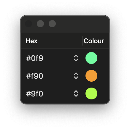
Drawable Cell API
Drawable Cells allow for rendering geometry and creating extensive interactive controls.
using System.Collections.ObjectModel;
using System.Collections.Generic;

using Eto.Drawing;
using Eto.Forms;

var colours = new List<string> { "#0f9", "#f90", "#9f0" };

var items = new ObservableCollection<object>();
items.Add(new List<object> () { colours[0] });
items.Add(new List<object> () { colours[1] });
items.Add(new List<object> () { colours[2] });

var drawableCell = new DrawableCell();
drawableCell.Paint += (s, e) => {
    if (e.Item is not List<object> list) return;
    var colRef = list[0].ToString();

    if (!Color.TryParse(colRef, out var color)) return;

    var rect = new RectangleF(5, 5, 20, 20);
    e.Graphics.FillEllipse(color, rect);
};

var dialog = new Dialog()
{
  Content = new GridView()
  {
    RowHeight = 30,
    Columns = {
      new GridColumn()
      {
        HeaderText = "Hex",
        Editable = true,
        DataCell = new ComboBoxCell(0)
        {
            DataStore = colours
        },
      },
      new GridColumn()
      {
        HeaderText = "Colour",
        DataCell = drawableCell,
        Resizable = false,
      },
    },
    DataStore = items
  },
};

var parent = RhinoEtoApp.MainWindowForDocument(__rhino_doc__);
dialog.Show(parent);
from System.Collections.ObjectModel import ObservableCollection

import Eto.Drawing as ed
import Eto.Forms as ef

colours = [ "#0f9", "#f90", "#9f0" ]

items = ObservableCollection[object]()
items.Add(colours[0])
items.Add(colours[1])
items.Add(colours[2])

def paint_cell(sender, args):
    if args.Item is None:
        return

    color = ed.Color.Parse(args.Item)

    rect = ed.RectangleF(5, 5, 20, 20);
    args.Graphics.FillEllipse(color, rect)

drawable_cell = ef.DrawableCell()
drawable_cell.Paint += paint_cell

combo_cell = ef.ComboBoxCell(1)
combo_cell.DataStore = colours

key_column = ef.GridColumn()
key_column.HeaderText = "Hex"
key_column.Editable = True
key_column.DataCell = combo_cell

value_column = ef.GridColumn()
value_column.HeaderText = "Colour"
value_column.DataCell = drawable_cell
value_column.Resizable = False

gridView = ef.GridView()
gridView.DataStore = items
gridView.Columns.Add(key_column)
gridView.Columns.Add(value_column)

dialog = ef.Dialog()
dialog.Content = gridView

dialog.ShowModal()
Custom Cell API
Custom Cells allow for very extensive Grid/Tree View customisation, however, with this extensibility comes great responsibility.
The example below mirrors the TextBoxCell, a Cell we’re already familiar with.
Take the below example, if you scroll, the nicely ordered number list will quite quickly turn into a disorganised mess, with different messes happening each time depending on scroll speed. Something is clearly wrong with this code, even though it compiles and reads fine.
using System.Linq;

using Eto.Forms;

using Rhino.UI;

var items = Enumerable.Range(0, 100).Cast<object>();

var customCell = new CustomCell();
customCell.CreateCell = (args) =>
    new TextBox() { Text = args.Item?.ToString() };

var dialog = new Dialog()
{
    Height = 200,
    Content = new GridView()
    {
        Columns = {
            new GridColumn()
            {
                HeaderText = "Value",
                DataCell = customCell
            },
        },
        DataStore = items
    },
};

var parent = RhinoEtoApp.MainWindowForDocument(__rhino_doc__);
dialog.ShowModal(parent);
import Eto.Forms as ef
from Rhino.UI import RhinoEtoApp

items = range(0, 100)

def create(args):
    text_box = ef.TextBox()
    text_box.Text = str(args.Item)

    return text_box

custom_cell = ef.CustomCell()
custom_cell.CreateCell = create

value_column = ef.GridColumn()
value_column.HeaderText = "Value"
value_column.Editable = True
value_column.DataCell = ef.TextBoxCell(1)

gridView = ef.GridView()
gridView.DataStore = items
gridView.Columns.Add(value_column)

dialog = ef.Dialog()
dialog.Height = 200
dialog.Content = gridView

var parent = RhinoEtoApp.MainWindowForDocument(__rhino_doc__);
dialog.ShowModal(parent)
A note on Efficiency
In our example we only have 100 items, consider however, that a small excel spreadsheet that is 100x100 in size, would contain 10,000 cells. To ensure the application is responsive and does not consume excessive memory, the UI only renders the controls we can see. The UI even reuses Grid Cells, if we scroll down, Cells at the top are reused for the new bottom cells that appear on our screen.
For this reason it is important that Cells are not considered unique. Each Cell WILL be re-used and updated regularly with a new DataContext. You MUST respond to this change to avoid messes. This can be done inside of ConfigureCell.
CreateCell
CreateCell is called once and once only.
Handling data context (also known as state) inside CreateCell will cause problems.CreateCell should ONLY create things that do not change per cell.
- Control Layout
- Bindings
- Event Subscriptions (Be careful with these, avoid OnLoad, OnShown, OnUnload etc. as they will fire constantly as a user scrolls. Control specific events such as CheckedChanged should also be used with caution.)
ConfigureCell
ConfigureCell is for setting data context, and managing state.
ConfigureCell is called every time the Cell is given a new DataContext. Hence Bindings should still be created in CreateCell or else the Cell will quickly fill up with bindings causing the problem to slow down.
With both samples combined, the UI behaves as expected, remaining ordered.
var customCell = new CustomCell();

customCell.CreateCell = (args) => new TextBox();

customCell.ConfigureCell = (args, control) => {
    if (control is not TextBox textBox) return;
    textBox.Text = args.Item?.ToString();
};
def create(args):
    return ef.TextBox()

def config(args, control):
    config.Text = str(args.Item)

custom_cell = ef.CustomCell()

custom_cell.CreateCell = create

custom_cell.ConfigureCell = config
