
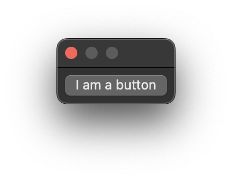
Buttons API
Buttons offer simple click → action functionality.
using Eto.Forms;
using Eto.Drawing;
using Rhino.UI;

var parent = RhinoEtoApp.MainWindowForDocument(__rhino_doc__);

var button = new Button() { Text = "I am a button" };
button.Click += (s, e) => { MessageBox.Show("You clicked me"); };

var dialog = new Dialog()
{
  Padding = 8,
  Content = button
};

dialog.ShowModal(parent);
import scriptcontext as sc

import Rhino
from Rhino.UI import RhinoEtoApp, EtoExtensions

import Eto.Drawing as ed
import Eto.Forms as ef


def show_message(sender, e):
  ef.MessageBox.Show("You clicked me")

parent = RhinoEtoApp.MainWindowForDocument(sc.doc)

dialog = ef.Dialog()
dialog.Padding = ed.Padding(8)

button = ef.Button()
button.Click += show_message
button.Text = "I am a button"

dialog.Content = button
dialog.ShowModal(parent)
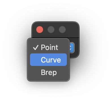
Drop Down API
Drop Downs store a collection of items and force a user to choose one, drop downs are favourable when the length of data can change or is more than 3-4 items.
using Eto.Forms;
using Eto.Drawing;
using Rhino.UI;

var parent = RhinoEtoApp.MainWindowForDocument(__rhino_doc__);

string[] items = new [] {
    "Point", "Curve", "Brep",
};

var dropDown = new DropDown()
{
    DataStore = items,
    SelectedIndex = 0
};

var dialog = new Dialog()
{
    Padding = 8,
    Content = dropDown
};

dialog.ShowModal(parent);
import scriptcontext as sc

import Rhino
from Rhino.UI import RhinoEtoApp, EtoExtensions

import Eto.Drawing as ed
import Eto.Forms as ef

parent = RhinoEtoApp.MainWindowForDocument(sc.doc)

dialog = ef.Dialog()
dialog.Padding = ed.Padding(8)

drop_down = ef.DropDown()
drop_down.DataStore = ["Point", "Curve", "Brep" ]
drop_down.SelectedIndex = 0

dialog.Content = drop_down
dialog.ShowModal(parent)
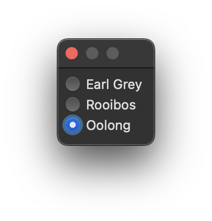
Radio Buttons API
Radio Button Lists store a list of items and force a user to choose one item. Radio Buttons are not suitable for longer lists and instead a Drop Down should be preferred.
using Eto.Forms;
using Eto.Drawing;
using Rhino.UI;

var parent = RhinoEtoApp.MainWindowForDocument(__rhino_doc__);

string[] items = new [] {
    "Earl Grey", "Rooibos", "Oolong",
};


var buttonList = new RadioButtonList()
{
    DataStore = items,
    Orientation = Orientation.Vertical,
    Spacing = new Size(4, 4)
};

var dialog = new Dialog()
{
    Padding = 8,
    Content = buttonList
};

dialog.ShowModal(parent);
import scriptcontext as sc

import Rhino
from Rhino.UI import RhinoEtoApp, EtoExtensions

import Eto.Drawing as ed
import Eto.Forms as ef

parent = RhinoEtoApp.MainWindowForDocument(sc.doc)

dialog = ef.Dialog()
dialog.Padding = ed.Padding(8)

button_list = ef.RadioButtonList()
button_list.DataStore = ["Earl Grey", "Rooibos", "Oolong"]
button_list.Orientation = ef.Orientation.Vertical
button_list.Spacing = ed.Size(4, 4)

dialog.Content = button_list
dialog.ShowModal(parent)
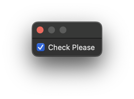
Check Boxes API
Check Boxes can exist individually or as a group by using the CheckBoxGroup.
Check Boxes have 3 states, checked, unchecked and indeterminate. The 3rd state can be set using Null as the Checked value is bool?.
using Eto.Forms;
using Eto.Drawing;
using Rhino.UI;

var parent = RhinoEtoApp.MainWindowForDocument(__rhino_doc__);

var checkBox = new CheckBox()
{
    Text = "Check Please",
    Checked = true,
};

var dialog = new Dialog()
{
    Padding = 8,
    Content = checkBox
};

dialog.ShowModal(parent);
import scriptcontext as sc

import Rhino
from Rhino.UI import RhinoEtoApp, EtoExtensions
import Eto.Forms as ef
import Eto.Drawing as ed

parent = RhinoEtoApp.MainWindowForDocument(sc.doc)

dialog = ef.Dialog()
dialog.Padding = ed.Padding(8)

check_box = ef.CheckBox()
check_box.Checked = True
check_box.Text = "Check Please"

dialog.Content = check_box
dialog.ShowModal(parent)
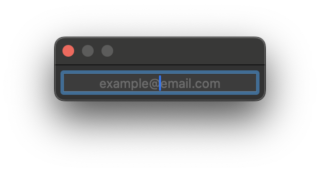
Text Box API
The Text box is meant for simple, short inputs like an email address, password, name, etc.
using Eto.Forms;
using Eto.Drawing;
using Rhino.UI;

var parent = RhinoEtoApp.MainWindowForDocument(__rhino_doc__);

var textBox = new TextBox()
{
    TextAlignment = TextAlignment.Center,
    Width = 200,
    PlaceholderText = "example@email.com"
};

var dialog = new Dialog()
{
    Padding = 8,
    Content = textBox
};

dialog.ShowModal(parent);
import scriptcontext as sc

import Rhino
from Rhino.UI import RhinoEtoApp, EtoExtensions
import Eto.Forms as ef
import Eto.Drawing as ed

parent = RhinoEtoApp.MainWindowForDocument(sc.doc)

dialog = ef.Dialog()
dialog.Padding = ed.Padding(8)

text_box = ef.TextBox()

text_box.TextAlignment = ef.TextAlignment.Center
text_box.Width = 200
text_box.PlaceholderText = "example@email.com"

dialog.Content = text_box
dialog.ShowModal(parent)
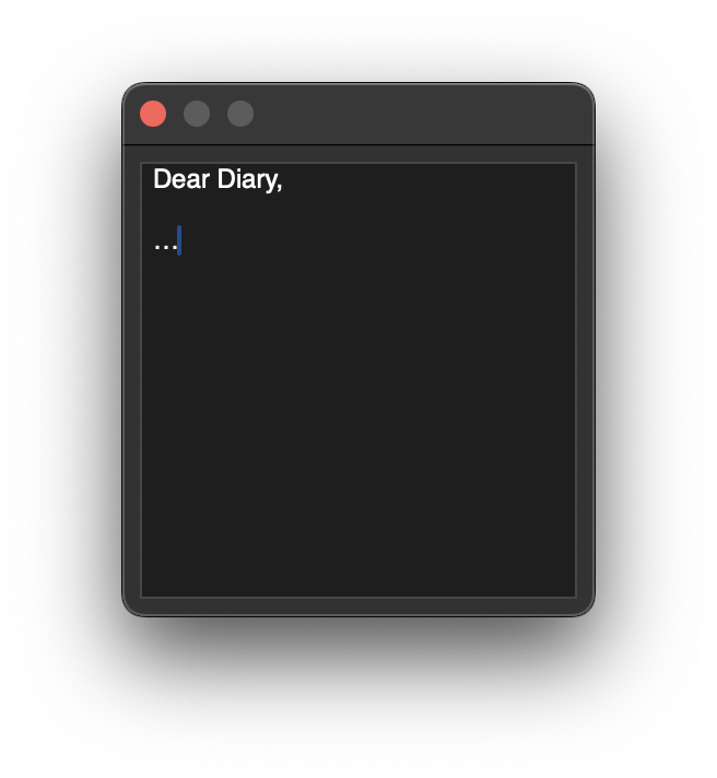
Text Area API
The text area is for longer, multiline text values and offers more options suited to a larger text input.
using Eto.Forms;
using Eto.Drawing;
using Rhino.UI;

var parent = RhinoEtoApp.MainWindowForDocument(__rhino_doc__);

var textArea = new TextArea()
{
    TextAlignment = TextAlignment.Left,
    AcceptsReturn = true,
    Width = 200,
    Height = 200
};

var dialog = new Dialog()
{
    Padding = 8,
    Content = textArea
};

dialog.ShowModal(parent);
import scriptcontext as sc

import Rhino
from Rhino.UI import RhinoEtoApp, EtoExtensions
import Eto.Forms as ef
import Eto.Drawing as ed

parent = RhinoEtoApp.MainWindowForDocument(sc.doc)

dialog = ef.Dialog()
dialog.Padding = ed.Padding(8)

text_area = ef.TextArea()

text_area.TextAlignment = ef.TextAlignment.Left
text_area.AcceptsReturn = True
text_area.Width = 200
text_area.Height = 200

dialog.Content = text_area
dialog.ShowModal(parent)
