
Eto is an open source cross-platform dialog box framework available in Rhino 6. This guide demonstrates the syntax required to create the most common Eto controls in Rhino.Python. Eto controls include labels, buttons, edit boxes and sliders. In Eto there are more than 35 different controls that can be created.
For details on creating a complete Eto Dialog in Rhino.Python go to the Getting Started with Eto Guide. The samples in this guide can be added to the controls section of the Basic dialog framework covered in the Getting Started Guide.
Buttons
Buttons are placed on almost every dialog.

Creating a new button is simple. Use the forms.Button and specify the Text that is shown on the button face. In addition to creating the new button, an action is commonly attached through the .Click event. Use the += syntax as shown below to bind the action to button.
        self.m_button = forms.Button(Text = 'OK')
        self.m_button.Click += self.OnButtonClick
The bound method, listed later in the calss definition is run if the button is clicked.
    # Close button click handler
    def OnOKButtonClick(self, sender, e):
        if self.m_textbox.Text == "":
            self.Close(False)
        else:
            self.Close(True)
In this specific case the button is clicked and the bound method OnOKButtonClick checks the Text of the m_textbox to to determine if anything has been entered. Then the method closes the dialog, returning either True or False.
The Eto.Dialog class has two special reserved names for buttons, the DefaultButton and the AbortButton. The DefaultButton name will create a button that is a standard button and also will receive a click event if the Enter Key is used. The AbortButton is a button that recieves a .Click event if the ESC key is used. These buttons are simple assigned through the name of the control, using self syntax.
The syntax for the DefaultButton is:
self.DefaultButton = forms.Button(Text = 'OK')
And for the AbortButton is:
self.AbortButton = forms.Button(Text = 'Cancel')
The DefaultButton and AbortButton normally close the dialog by using the self.close() method of the dialog. Please note that even though the dialog is closed, that values of the controls are still accesable to the rest of the script.
More details can be found in the Eto Button API Documentation.
Calendar
A Calendar control is used to pick a date or range of dates.
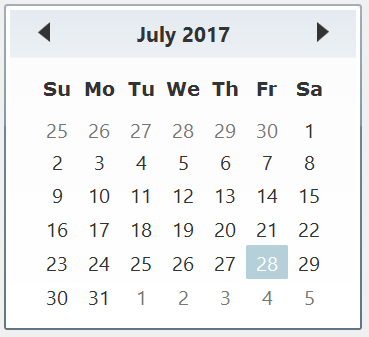
Creating a Calender is very simple:
    #Create a Calender
    self.m_calender = forms.Calendar()
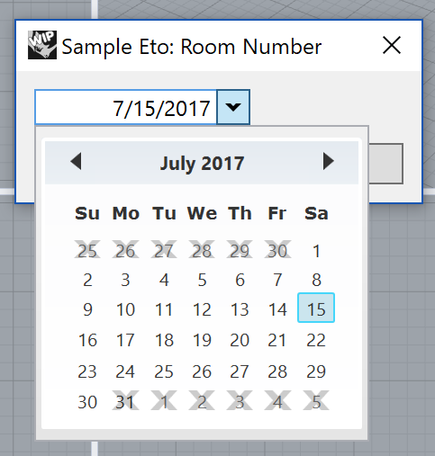
Often other properties are set on the calendar control. There are a number of properties of a calender control that can be used to modify how the control works.
    #Create a Calendar
    self.m_calendar = forms.Calendar()
    self.m_calendar.Mode = forms.CalendarMode.Single
    self.m_calendar.MaxDate = System.DateTime(2017,7,31)
    self.m_calendar.MinDate = System.DateTime(2017,7,1)
    self.m_calendar.SelectedDate = System.DateTime(2017,7,15)
The .Mode property sets if only a single date can be setting forms.CalendarMode.Single or date range can be selected by setting .mode to forms.CalendarMode.Range.
The MaxDate and .MinDate property limits the range of dates that can be selected from.
The .SelectedDate will result in that date being initially selected.
More details can be found in the Eto Calendar API Documentation.
CheckBox
A Checkbox control can be used to specify True and False:
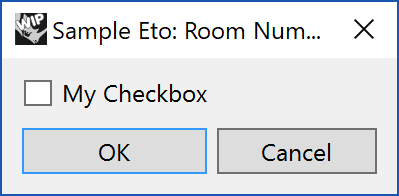
The simpliest syntax for a CheckBox is:
    #Create a Checkbox
    self.m_checkbox = forms.CheckBox(Text = 'My Checkbox')
The Text property set the text visibel next to the control. By default the CheckBox is unchecked and carries a value of None. Once checked it contains a booloean value of True. Once unchecked, the value is False.
The intial state of the checkbox can be set in the class. The checkbox will be checked by default by adding the line:
self.m_checkbox.Checked = True
More details can be found in the Eto Checkbox API Documentation.
ColorPicker
To select a single color from a drop down use the ColorPicker. This control also supports a right-click menu on the dropdown arrow. The right-click menu gives access to the eye dropper and the standard system color picker dialog.
This simple code below will create a color picker with a blank default color:
        #Create a ColorPicker Control
        self.m_colorpicker = forms.ColorPicker()
The initial default color may be set in the control by adding the code:
        defaultcolor = Eto.Drawing.Color.FromArgb(255, 0,0)
        self.m_colorpicker.Value = defaultcolor
More details can be found in the Eto ColorPicker API Documentation and Eto.Drawing.Color Documentation
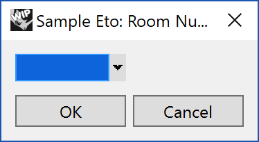
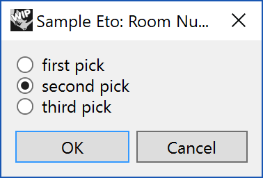
ComboBox
A Combo box is a drop down list of items that also allows input of text directly:
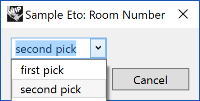
        #Create Combobox
        self.m_combobox = forms.ComboBox()
        self.m_combobox.DataStore = ['first pick', 'second pick', 'third pick']
The default value can be set to display by adding the index postition to the DataStore property:
self.m_combobox.SelectedIndex = 1
DateTimePicker
Use the DateTimePicker to select a date and/or a time:
Similiar to the Calendar control, there is also a DateTimePicker. The .Mode can be set on the control to display the .Date or .Time. The .Date version differs from the .Calendar control by accessing the date through a dropdown menu:
        #Create DateTime Picker in Date mode
        self.m_datetimedate = forms.DateTimePicker()
        self.m_datetimedate.Mode = forms.DateTimePickerMode.Date
        self.m_datetimedate.MaxDate = System.DateTime(2017,7,30)
        self.m_datetimedate.MinDate = System.DateTime(2017,7,1)
        self.m_datetimedate.Value = System.DateTime(2017,7,15)
The .Time mode creates a spinner where the time of day can be selected:
        #Create DateTime Picker in Date mode
        self.m_datetimetime = forms.DateTimePicker()
        self.m_datetimetime.Mode = forms.DateTimePickerMode.Time
        self.m_datetimetime.Value = System.DateTime.Now
        self.m_datetimetime.Value = System.DateTime(2017, 1, 1, 23, 43, 49, 500)
More details can be found in the Eto DateTimePicker API Documentation.
DropDown
Drop down menu with a list of items.
        #Create Dropdown List
        self.m_dropdownlist = forms.DropDown()
        self.m_dropdownlist.DataStore = ['first', 'second', 'third']
The default selection can be set by using the index location in the DataStore:
self.m_dropdownlist.SelectedIndex = 1
More details can be found in the Eto DropDown API Documentation.
GridView
A virtualized grid of data with editable cells. The GridView is used to emulate a ListView control:
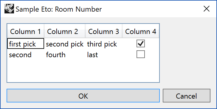
Creating a .GridView() is more involved then othe ETo controls. Start by creating the .GridView then populate the control with forms.GridColumn(). Each .GridColumn has a .HeaderText, .Editable property and contains a .DataCell. The .DataCell can display a TextBoxCell or a CheckBoxCell. After each .GridColumn is created, then add it to the .GridView through the self.m_gridview.Columns.Add(column1) method. The sample below populates 4 columns in the .GridView:
        #Create Gridview
        self.m_gridview = forms.GridView()
        self.m_gridview.ShowHeader = True
        self.m_gridview.DataStore = (['first pick', 'second pick', 'third pick', True],['second','fourth','last', False])

        column1 = forms.GridColumn()
        column1.HeaderText = 'Column 1'
        column1.Editable = True
        column1.DataCell = forms.TextBoxCell(0)
        self.m_gridview.Columns.Add(column1)

        column2 = forms.GridColumn()
        column2.HeaderText = 'Column 2'
        column2.Editable = True
        column2.DataCell = forms.TextBoxCell(1)
        self.m_gridview.Columns.Add(column2)

        column3 = forms.GridColumn()
        column3.HeaderText = 'Column 3'
        column3.Editable = True
        column3.DataCell = forms.TextBoxCell(2)
        self.m_gridview.Columns.Add(column3)

        column4 = forms.GridColumn()
        column4.HeaderText = 'Column 4'
        column4.Editable = True
        column4.DataCell = forms.CheckBoxCell(3)
        self.m_gridview.Columns.Add(column4)
Accessing the values in each cell of the forms.GridView can be done by using the index position of the value in the .DataStore property.
dialog.m_gridview.DataStore[1][2]
This will result in a value of ’third pick’ in the above example.
More details can be found in the Eto GridView API Documentation.
GroupBox
A GroupBox displays a collection of controls surrounded by a border and optional title to identify the group:
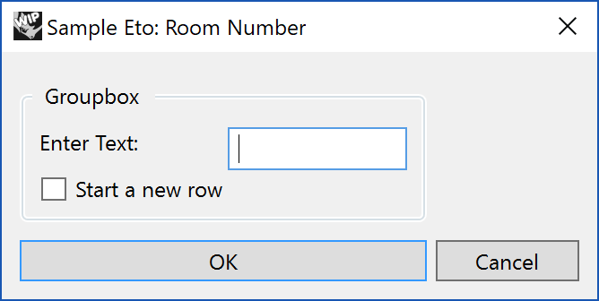
Like the larger dialog, the forms.GroupBox() requires a Layout to help position controls. Within the layout, controls are placed. Once the controls are created, the controls are added to rows in the layout, which is then added to the contents of the forms.GroupBox with the line self.m_groupbox.Content = grouplayout:
# Create a group box
        self.m_groupbox = forms.GroupBox(Text = 'Groupbox')
        self.m_groupbox.Padding = drawing.Padding(5)

        grouplayout = forms.DynamicLayout()
        grouplayout.Spacing = Size(3, 3)

        label1 = forms.Label(Text = 'Enter Text:')
        textbox1 = forms.TextBox()

        checkbox1 = forms.CheckBox(Text = 'Start a new row')

        grouplayout.AddRow(label1, textbox1)
        grouplayout.AddRow(checkbox1)

        self.m_groupbox.Content = grouplayout
More details can be found in the Eto GroupBox API Documentation.
ImageView
A control to display a single bitmap image:
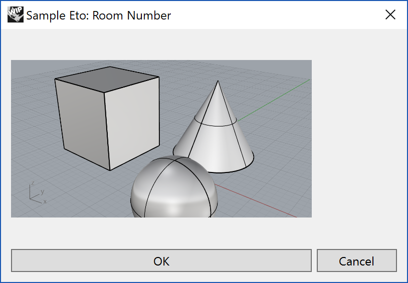
Creating a space for a ImageView is easy. The first 3 lines below create the forms.ImageView() and set its size. Populating formatting a bitmap to show in the forms.ImageView() is more difficult. In this sample a RHino view Capture is converted into a drawing.Bitmap() and set to the .Image property to show in the forms.ImageView().
# Create an image view
        self.m_image_view = forms.ImageView()
        self.m_image_view.Size = drawing.Size(300, 200)
        self.m_image_view.Image = None

        # Capture the active view to a System.Drawing.Bitmap
        view = scriptcontext.doc.Views.ActiveView
        self.m_image_view.Image = Rhino.UI.EtoExtensions.ToEto(view.CaptureToBitmap())
Bitmaps may be formatted from a number of different forms. In this case the view.CaptureToBitmap() image is translated to an Eto bitmap using the Rhino.UI.EtoExtensions.ToEto() method.
More details can be found in the Eto ImageView API Documentation.
Label
The simplest Eto Control is the forms.Label(). It is text that normally is used to create a prompt, label, message or description for another control.

self.m_label = forms.Label(Text = 'Enter the Room Number:')
As with many controls, the line above create a name for the control m_label. Then the main property of a Label is the text it shows by setting the Text Property of the label.
Normally this is as complex as a label needs to get, but a label also has many more properties. Additonal properties include VerticalAlignment, Horizontal Alignment, TextAlignment, Wrap, TextColor, and Font. Properties can be added to the Label() by including each keyword separated by a comma(,) as follows:
self.m_label = forms.Label(Text = 'Enter the Room Number:', VerticalAlignment = VerticalAlignment.Center)
Labels also can be created directly in layouts directly. There is a shorthand syntax when adding controls to a layout that will automatically create a forms.Label
  #Adds a new Label diplaying "Camera:"
  layout.AddRow('Camera:', None)

  #Adds a new label displaying "Name :" inline with the Textbox control.
  layout.AddRow('Name:', forms.TextBox(Text = 'Persp1'))
When adding Rows or Columns, a simple string can be inserted. Eto will automatically create a Label out of the string. This is a very fast way yo make forms.Label.
For a complete list of properties and events of the Label class, see the Eto Label Class documentation.
LinkButton
A LinkButton is a simple label that acts like a button, similar to a hyperlink:
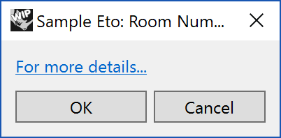
Like a standard button the forms.LinkButton() needs to be bound to an action through the += syntax:
# Create LinkButton
        self.m_linkbutton = forms.LinkButton(Text = 'For more details...')
        self.m_linkbutton.Click += self.OnLinkButtonClick

    # Linkbutton click handler
    def OnLinkButtonClick(self, sender, e):
        webbrowser.open("http://rhino3d.com")
More details can be found in the Eto LinkButton API Documentation.
ListBox
Create a scrollable list of items to select:
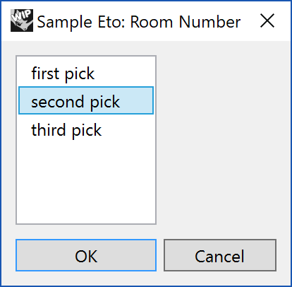
The forms.ListBox() and the .DataStore is required to create a forms.ListBox:
        #Create ListBox
        self.m_listbox = forms.ListBox()
        self.m_listbox.DataStore = ['first pick', 'second pick', 'third pick']
        self.m_listbox.SelectedIndex = 1
The self.m_listbox.SelectedIndex = 1 is optional and sets the default selected object withing the DataStore.
More details can be found in the Eto ListBox API Documentation.
NumericUpDown
Numeric control that allows the user to adjust the value with the mouse using a spinner:
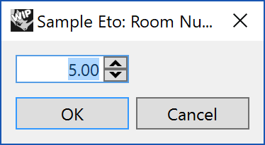
Controlling the behavior of the spinner when clicking on the up or down arrows is key to the forms.NumericUpDown() control:
# Create Numeric Up Down
        self.m_numeric_updown = forms.NumericUpDown()
        self.m_numeric_updown.DecimalPlaces = 2
        self.m_numeric_updown.Increment = 0.01
        self.m_numeric_updown.MaxValue = 10.0
        self.m_numeric_updown.MinValue = 1.0
        self.m_numeric_updown.Value = 5.0
More details can be found in the Eto NumericUpDown API Documentation.
PasswordBox
Use the forms.PasswordBox() to enter passwords or sensitive data with the text masked out:
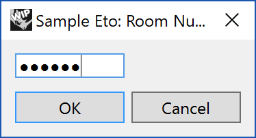
The .MaxLength property is optional:
# Create Password Box
        self.m_password = forms.PasswordBox()
        self.m_password.MaxLength = 7
More details can be found at the Eto PasswordBox API Documentation.
ProgressBar
Use the forms.ProgressBar to display the progress of long running tasks:
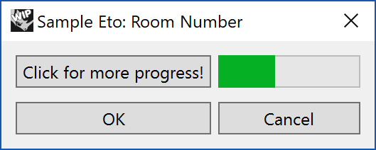
The first step is to create the forms.ProgressBar with its minmimu and maxmum values:
# Create Progress Bar
        self.m_progressbar = forms.ProgressBar()
        self.m_progressbar.MinValue = 0
        self.m_progressbar.MaxValue = 10
The control can be set through the .Value property on the control as in the last line in the example below:
self.m_progress = 1

    # GoButton button click handler
    def OnGoButtonClick(self, sender, e):
        self.m_progress = self.m_progress + 1
        if self.m_progress > 10:
            self.m_progress = 10
        self.m_progressbar.Value = self.m_progress
More details can be found in the Eto ProgressBar API Documentation.
RadioButtonList
Create a series of Radio buttons that allow a single selection out of the list:
Creating the forms.RadioButtonList() control is simple. Then populate the list with a .DataStore:
# Create Radio Button List Control
        self.m_radiobuttonlist = forms.RadioButtonList()
        self.m_radiobuttonlist.DataStore = ['first pick', 'second pick', 'third pick']
        self.m_radiobuttonlist.Orientation = forms.Orientation.Vertical
        self.m_radiobuttonlist.SelectedIndex = 1
The .Orientation of the list can be set to forms.Orientation.Vertical or forms.Orientation.Horizontal. This is an optional property.
The .SelectedIndex sets the initial default selected object in the list.
More details can be found in the Eto RadioButtonList API Documentation.
RichTextArea
Multi-line text area with rich text formatting:
This differs from the TextBox in that it is used for multi-line text entry and can accept Tab and Enter input.
# Create Rich Text Edit Box
        self.m_richtextarea = forms.RichTextArea()
        self.m_richtextarea.Size = drawing.Size(400, 400)
The text can be formatted by using keystrokes. While these keystrokes may vary on different platforms, a good list of modifier keystrokes for this control can be found on the Microsoft MSDN Editing Commands documentation.
More details can be found in the Eto RichTextArea API Documentation.
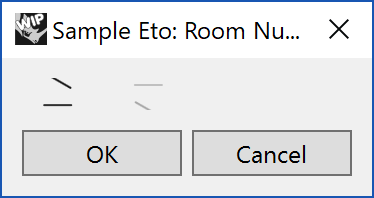
Slider
A horizontal or vertical slider to select a value from a range:
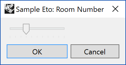
A slider consists of the control, the maximum and minimum values. The initial .Value can also be set at the time the dialog is created:
# Create a slider
        self.m_slider = forms.Slider()
        self.m_slider.MaxValue = 10
        self.m_slider.MinValue = 0
        self.m_slider.Value = 3
To set the sldier into a vertical orientation, add the line:
self.m_slider.Orientation = forms.Orientation.Vertical
More details can be found in the Eto Slider API Documentation.
Spinner
A spinner to show indeterminate progress in compact space:
When creating the forms.Spinner(), setting the .Enabled to True willl activate the spinning motion:
# Create Spinner
        self.m_spinner = forms.Spinner()
        self.m_spinner.Enabled = True
More details can be found in the Eto Spinner API Documentation.
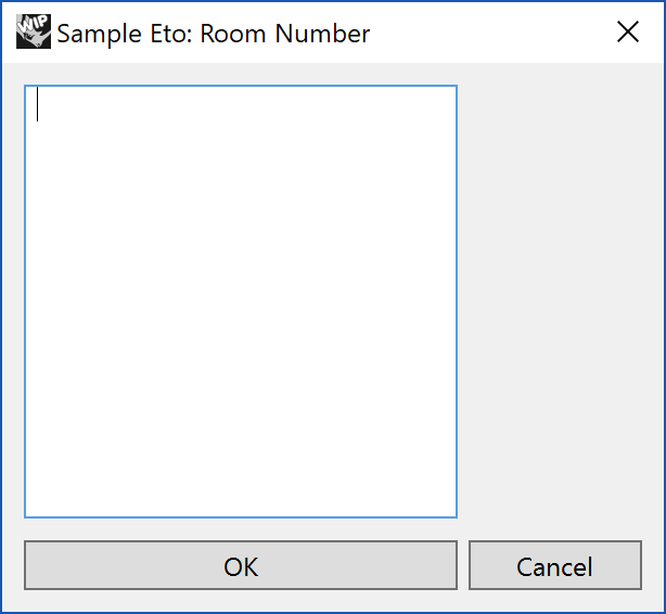
TextArea
Multi-line text control with scrollbars:
A simplified version of the forms.RichTextArea(). The forms.TextArea() controls needs only a couple lines:
# Create Text Area Box
        self.m_textarea = forms.TextArea()
        self.m_textarea.Size = drawing.Size(400, 400)
More details can be found in the Eto TextArea API Documentation.
TextBox
A TextBox is used to enter a string into the dialog.

To check the contents of the textbox in the script, the textbox control must have a name to reference it.
self.m_textbox = forms.TextBox()
In this case the name m_textbox can be used to reference the control later in the class method starting on line 44:
    # Get the value of the textbox
    def GetText(self):
        return self.m_textbox.Text
Just creating a new Eto.Forms.TextBox() is common. There are a number of additional properties of a TextBox which can be used to control the input. These properties include MaxLength, PlaceholderText, InsertMode and many more that can be seen in the Eto TextBox Class.
TreeGridView
A TreeView with additional property columns:
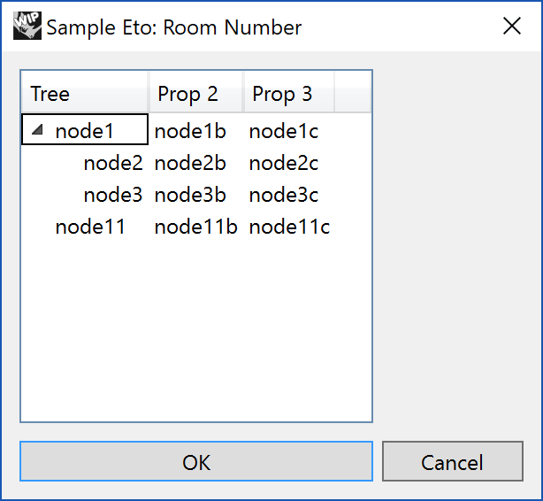
The TreeGridView takes the two most sophisticated controls in Eto, TreeView and GridView to combine them into one control. This make the control powerful, but also requires very specific syntax to work. The first two lines are standard, create the forms.TreeGridView() and set its size:
The forms.TreeView() control requires some very specific syntax. The general TreeView container is easy enough. Set the object up and then its size. If editing of the items in the tree, then the .LabelEdit property can be set to True.
# Create TreeGridView
        self.m_treegridview = forms.TreeGridView()
        self.m_treegridview.Size = drawing.Size(200, 200)

        column1 = forms.GridColumn()
        column1.HeaderText = 'Tree'
        column1.Editable = True
        column1.DataCell = forms.TextBoxCell(0)
        self.m_treegridview.Columns.Add(column1)

        column2 = forms.GridColumn()
        column2.HeaderText = 'Prop 2'
        column2.Editable = True
        column2.DataCell = forms.TextBoxCell(1)
        self.m_treegridview.Columns.Add(column2)

        column3 = forms.GridColumn()
        column3.HeaderText = 'Prop 3'
        column3.Editable = True
        column3.DataCell = forms.TextBoxCell(2)
        self.m_treegridview.Columns.Add(column3)

        treecollection = forms.TreeGridItemCollection()
        item1 = forms.TreeGridItem(Values=('node1', 'node1b', 'node1c'))
        item1.Expanded = True
        item1.Children.Add(forms.TreeGridItem(Values=('node2', 'node2b', 'node2c')))
        item1.Children.Add(forms.TreeGridItem(Values=('node3', 'node3b', 'node3c')))
        treecollection.Add(item1)
        item2 = forms.TreeGridItem(Values=('node11', 'node11b', 'node11c'))
        treecollection.Add(item2)
        self.m_treegridview.DataStore = treecollection
After setting up the forms.TreeGridView() the columns to display in the control need to be created as form.GridColumn(). The .DataCell property points to the forms.TextBoxCell(index) that exists in the .DataStore assigned at the last line of this script.
The information for for a tree is stored into a forms.TreeGridCollection(). Items within the tree are a forms.TreeGridItems that have .Values of tuples. Each tuple will populate a row in the forms.TreeGridView().
The forms.TreeGridView does not automatically update it contents. After all the control is setup, the DataStore is set to the treecollection. Doing this is a different order may end up in a control that does not display the data.
More details can be found in the Eto TreeGridView API Documentation.
WebView
Display a live web page in a panel:
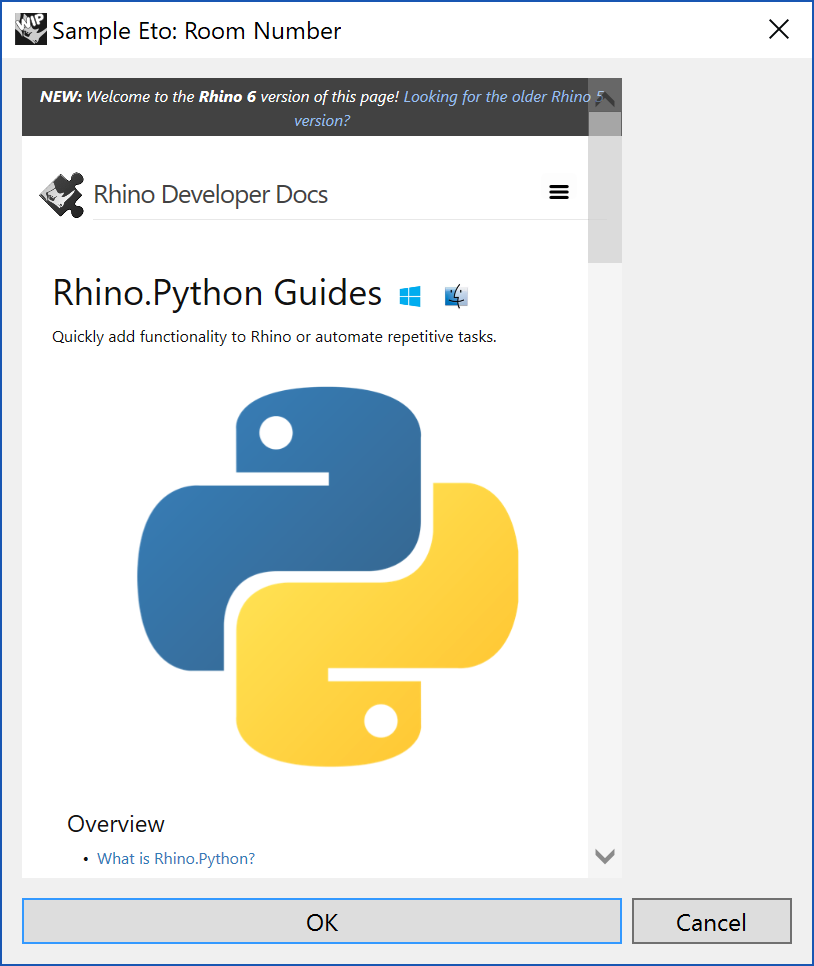
Creating the forms.WebView() is simple by creating the webview, then to set its size. The starting web URL can be set through the use of a System.Uri set to the .Url property:
# Create a WebView
        self.m_webview = forms.WebView()
        self.m_webview.Size = drawing.Size(300, 400)
        self.m_webview.Url = System.Uri('http://developer.rhino3d.com/guides/rhinopython/')
More details can be found in the Eto WebView API Documentation.
Sample Dialogs
Now with some understanding of Eto Dialogs in Python, take a look at some of the Sample dialogs in the Python Developer Samples Repo:
