Eto is an open source cross-platform dialog box framework available in Rhino 6. This guide demonstrates the syntax required to create Layouts. Layouts are containers in which controls are placed. The Layout will position the controls in a dialog or another Layout. It is possible to nest Layouts within each other to handle more complex Layouts.
For details on creating a complete Eto Dialog in Rhino.Python go to the Getting Started with Eto Guide. The samples in this guide can be added to the controls section of the Basic dialog framework covered in the Getting Started Guide.
There are 5 different layout styles in Eto.
- Panel - Controls that subclass
Panel, such asWindow,GroupBox,Scrollable, etc allow you to specify a single child Content control - TableLayout - Similar to how an HTML table works, with a single control per cell
- PixelLayout - Specify X,Y coordinates for the position of each control (from Upper-Left)
- DynamicLayout - Dynamic hierarchical horizontal and vertical layout
- StackLayout - Horizontal or Vertical list of controls
This guide will focus on using the DynamicLayout style only. The forms.DynamicLayout() has a clear simple syntax in Python and is quite flexible.
Dynamic Layout
A layout in Eto is a virtual grid in which controls are placed. The layout arranges its child controls in a table structure of rows and columns. It is similar to the HTML table layout. Understanding how rows and columns interact with each other is the key to using layouts effectively.
AddRow Method
In its simplest form a layout is built row by row using the .AddRow method. Each .AddRow may contain one or more controls. If one control is added for each row a simple stack of rows are created and the controls will stretch to the width of the Layout:
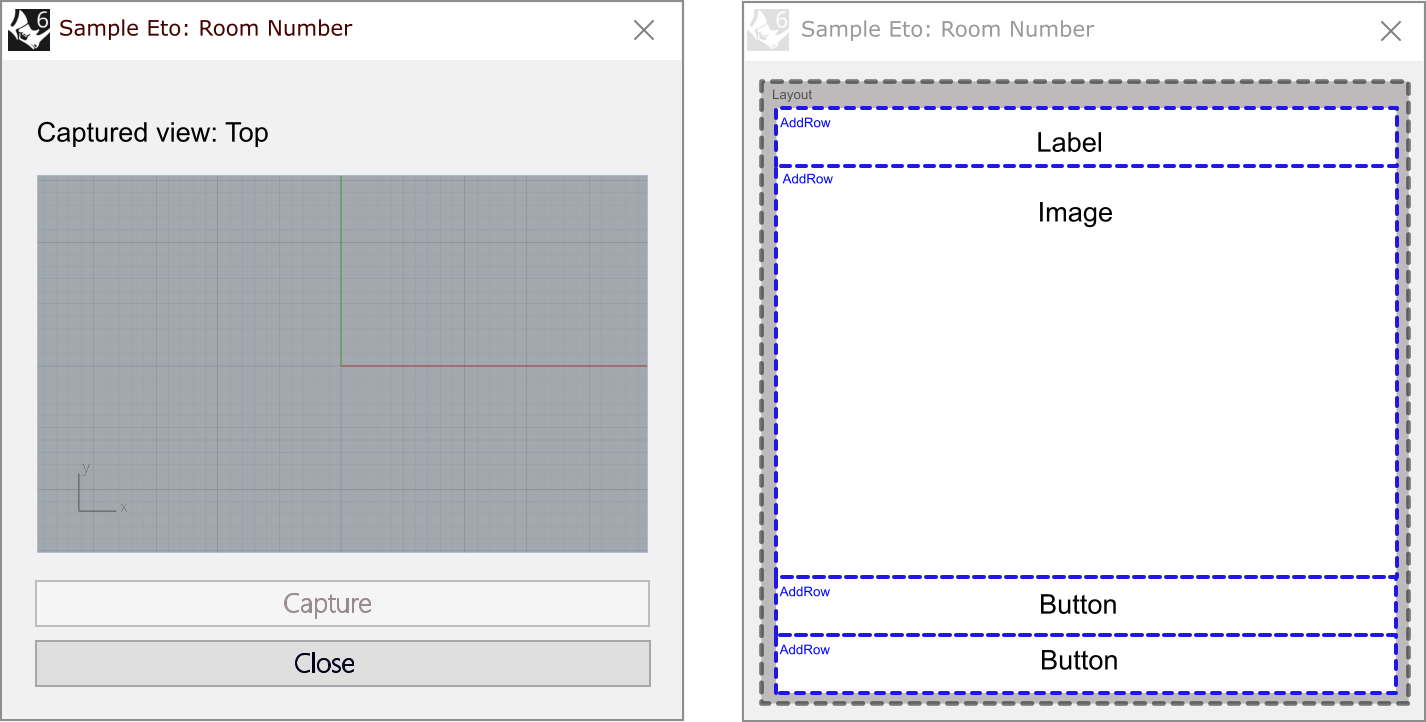
layout = forms.DynamicLayout()
layout.Spacing = drawing.Size(5, 5)

layout.AddRow(label)
layout.AddRow(image)
layout.AddRow(button-capture)
layout.AddRow(button-cancel)
Each successive .AddRow will add a new row to the table.
Of course dialogs are not often made up of only one control per row. .AddRow will create a new column cell for each control added with a single .AddRow statement:
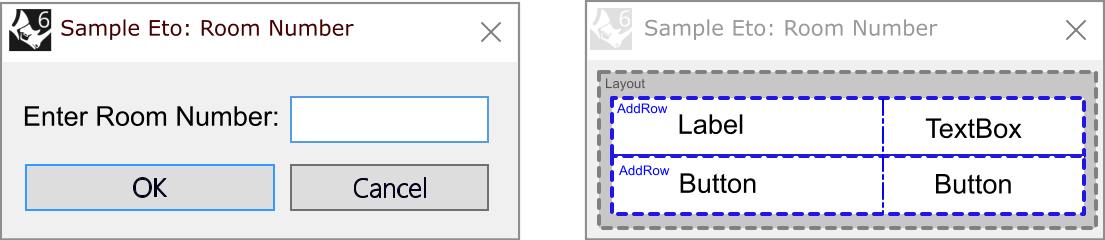
layout = forms.DynamicLayout()
layout.Spacing = drawing.Size(5, 5)

layout.AddRow(label, textbox)
layout.AddRow(button-OK, button-Cancel)
Because there are two controls added to each row, the layout creates a table with two cells per row. Not only the cells created, but the controls are lined up vertically based on the number of cells in each row. In this case the first column is sized to fit the larger text label. The OK button then must stretch to fill that column. Then textbox and Cancel button will also be sized the same.
Understanding that successive
.AddRowstatements will create cells that are vertically aligned is an important concept. The row with the most controls dictates the number of colums in the table.
A single strong vertical alignment throughout the dialog may not work, especially is there is a different number of controls on each row. There is a need to be able to control how controls are aligned and sized. Use breaks and spacers to create more sophisticated layouts.
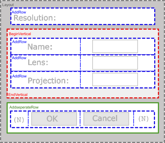
Vertical Break
Tables in a .DynamicLayout() can be separated using the .BeginVertical() and .EndVertical. The dynamic layout intrinsically starts with a vertical section. Additional breaks between tables can be created by placing a vertical break. The next .AddRow() will start a new table and the strong vertical alignment with previous rows is broken.
The example below shows how the justification of the rows does not have to lie within a single grid:
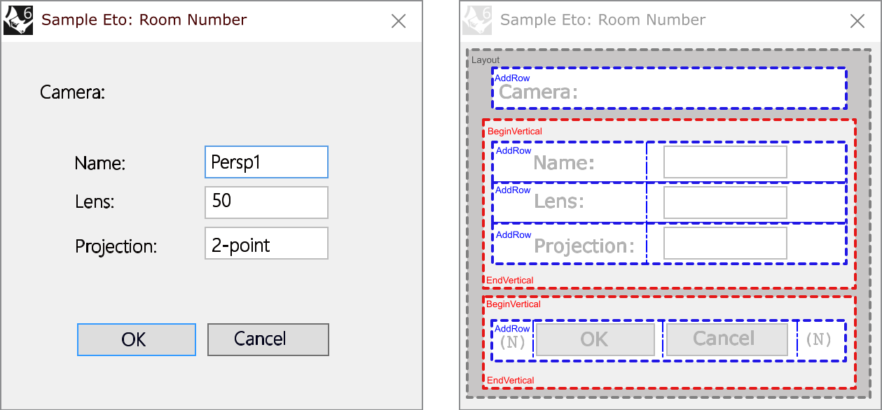
layout = forms.DynamicLayout()
layout.Spacing = drawing.Size(5, 5)

layout.AddRow('Camera:')

layout.BeginVertical()
layout.AddRow(label-name, textbox1)
layout.AddRow(label-lens, textbox2)
layout.AddRow(label-projection, textbox3)
layout.EndVertical()

layout.BeginVertical()
layout.AddRow(None, button-OK, button-cancel, None)
layout.EndVertical()
In addition to the .BeginVertical() there is also .BeginHorizontal() and.BeginCentered() to start new sections. For detail on these, look in the comments in the Eto DynamicLayout.cs file
None spacer
Using the None value in Python, spacers can be added in cells or as rows. None spacers will dynamically resize to fit the space needed. For instance use None to fill cells on rows to correctly layout a dialog:
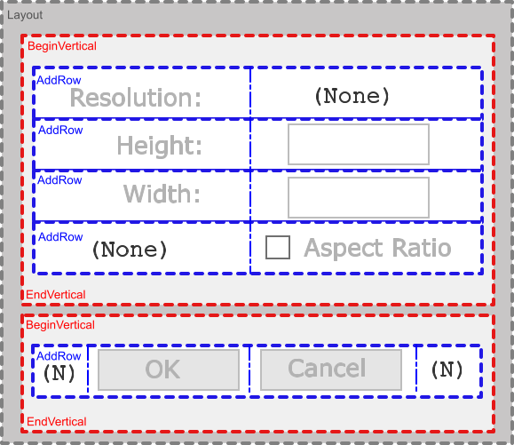
layout = forms.DynamicLayout()
layout.Spacing = drawing.Size(5, 5)

layout.BeginVertical()
layout.AddRow(label-resolution, None)
layout.AddRow(label-height, textbox2)
layout.AddRow(label-width, textbox3)
layout.AddRow(None, checkbox)
layout.EndVertical()

layout.BeginVertical()
layout.AddRow(None, button-OK, button-cancel, None)
layout.EndVertical()
Add Separate Row
The AddSeparateRow() method creates a single row of controls separated both horizontally and vertically from adjacent tables all in one single statement. The code below creates the same dialog as above, but uses the .AddSeparateRow() method:
layout = forms.DynamicLayout()
layout.Spacing = drawing.Size(5, 5)

layout.AddRow('Camera:')

layout.BeginVertical()
layout.AddRow(label-name, textbox1)
layout.AddRow(label-lens, textbox2)
layout.AddRow(label-projection, textbox3)
layout.EndVertical()

layout.AddSeparateRow(None, button-OK, button-cancel, None)
The layout.AddSeparateRow(None, button-OK, button-cancel, None) row is functionally equivalent to:
layout.BeginVertical()
layout.BeginHorizontal()
layout.AddRow(None, button-OK, button-cancel, None)
layout.EndHorizontal()
layout.EndVertical()
This makes AddSeparateRow() very convenient to create a set of OK and Cancel buttons row at the bottom of a dialog box.
Additional Samples
Now with some understanding of Eto Layouts, take a look at some of the Sample dialogs in the Python Developer Samples Repo:
