#include <RhinoSdkUiOptionsListCtrlItem.h>
Protected Types | |
| enum | begin_edit_item_reason { eir_label_left_clicked = 0, eir_value_left_clicked, eir_f2_pressed, eir_navigation_key, force_32bit_begin_edit_item_reason = 0xFFFFFFFF } |
Protected Member Functions | |
| virtual bool | BeginEditItem (CRhinoUiOptionsListCtrl &list_ctrl, const CRect rEdit, begin_edit_item_reason eir)=0 |
| bool | ForwardOnMouseWheel (CWnd &wnd, UINT nFlags, short zDelta, CPoint pt) |
| virtual void | MoveItemWindow (CRhinoUiOptionsListCtrl &list_ctrl, const CRect rEdit)=0 |
| virtual void | OnDrawItem (CDC &dc, const CRect &rItem, const CRect &rDeflate) const |
| bool | SetControlType (control_type ct) |
Protected Attributes | |
| CPoint | m_ptEndTrackSelect |
Friends | |
| class | CRhinoUiOptionsListCtrl |
Member Enumeration Documentation
◆ begin_edit_item_reason
|
protected |
Virtual methods
◆ control_type
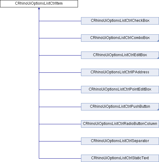
Description: Valid CRhinoUiOptionsListCtrlItem types
| Enumerator | |
|---|---|
| ct_static_text | implemented CRhinoUiOptionsListCtrlStaticText - Static text. Drawn same as label text. |
| ct_edit_box | CRhinoUiOptionsListCtrlEditBox - Edit box which may be used to modify strings or numbers. |
| ct_check_box | CRhinoUiOptionsListCtrlCheckBox - Normal or tri-state check box. |
| ct_combo_box | CRhinoUiOptionsListCtrlComboBox - Combo box, use the OnPopulateComboBox message to inialize. |
| ct_push_button | CRhinoUiOptionsListCtrlPushButton - Push button that generates nc_on_item_button_clicked notification event. |
| ct_ip_address | CRhinoUiOptionsListCtrlIPAddress - IP edit box. |
| ct_radio_buttons | CRhinoUiOptionsListCtrlRadioButtonColumn - Column of one or more radio buttons. |
| ct_color_combo_box | CRhinoUiOptionsListCtrlComboBox - Combo box containing list of standard colors and/or custom color option. |
| ct_color_button | CRhinoUiOptionsListCtrlButton - Color button that displays standard color dialog when pressed. |
| ct_file | CRhinoUiOptionsListCtrlFileNameEditBox - Edit box with "..." butto which displays file open dialog box. |
| ct_font_combo | CRhinoUiOptionsListCtrlFontComboBox - Combo box containing list of fonts installed on computer. |
| ct_layer_combo_box | CRhinoUiOptionsListCtrlLayerComboBox - Combo box containing list of layers in current document. |
| ct_linetype_combo_box | |
| ct_print_width_combo_box | |
| ct_separator | An item which spans both columns and simply displays a left justified label |
| ct_folder | not implemented yet |
| ct_hyperlink | |
| ct_custom_control | |
| ct_invalid | |
| force_32bit_control_type | for internal use only, this allows adding additional values without breaking the SDK in the future |
◆ item_property
| Enumerator | |
|---|---|
| full_row_item_property | |
| use_label_colors_property | |
| is_group_combo_item_property | DO NOT set this property, it will be set by the CRhinoUiOptionsListCtrlGroupComboBox constructor and identifies this item as a group combo box so it may be safely cast as such. |
| property0 | for future use |
| property1 | |
| property2 | |
| property3 | |
| property4 | |
| property5 | |
| property6 | |
| property7 | |
| property8 | |
| property9 | |
| force_32bit_item_property | for internal use only, this allows adding additional values without breaking the SDK in the future |
◆ item_state
Constructor & Destructor Documentation
◆ CRhinoUiOptionsListCtrlItem() [1/2]
| CRhinoUiOptionsListCtrlItem::CRhinoUiOptionsListCtrlItem | ( | control_type | ct = ct_invalid, |
| LPCTSTR | lpsLabel = NULL, |
||
| LPCTSTR | lpsText = NULL, |
||
| int | iIndentLevel = 0 |
||
| ) |
Description: Constructors
Parameters: ct [in] Type of control this is lpsLabel [in] Label for this item, appears in left column of options list lpsText [in] Text associated with this item, appears in right column of options list
◆ CRhinoUiOptionsListCtrlItem() [2/2]
| CRhinoUiOptionsListCtrlItem::CRhinoUiOptionsListCtrlItem | ( | const CRhinoUiOptionsListCtrlItem & | ) |
Description: Copy constructor
◆ ~CRhinoUiOptionsListCtrlItem()
|
virtual |
Description: Destructor
Member Function Documentation
◆ AutoDelete()
| bool CRhinoUiOptionsListCtrlItem::AutoDelete | ( | ) | const |
Description: This method returns the current state of the auto delete variable. If this returns true, which is the default, then this object is deleted automatically when the options list is destroyed. Use the SetAutoDelete() method to change this value.
Returns: Returns true to allow options list to delete this item.
◆ BeginEditItem()
|
protectedpure virtual |
Description: This method is called when a options list control item is selected. The method should create the control window used to change the items value.
Parameters: list_ctrl [in] The options list control calling this method. rEdit [in] The options list control item value bounding rectangle.
Returns: Should return true if the control has been successfully created; otherwise false.
Implemented in CRhinoUiOptionsListCtrlCheckBox, CRhinoUiOptionsListCtrlPushButton, CRhinoUiOptionsListCtrlRadioButtonColumn, CRhinoUiOptionsListCtrlLayerComboBox, CRhinoUiOptionsListCtrlColorComboBox, CRhinoUiOptionsListCtrlComboBox, CRhinoUiOptionsListCtrlIPAddress, CRhinoUiOptionsListCtrlFileNameEditBox, CRhinoUiOptionsListCtrlPointEditBox, CRhinoUiOptionsListCtrlEditBox, CRhinoUiOptionsListCtrlStaticText, and CRhinoUiOptionsListCtrlSeparator.
◆ ControlType()
| control_type CRhinoUiOptionsListCtrlItem::ControlType | ( | ) | const |
Description: This method identifies what type of control this is. This may be used to decide valid upcast for this item.
Returns: Returns control type
See Also: CRhinoUiOptionsListCtrlItem::control_type CRhinoUiOptionsListCtrlItem::SetControlType()
◆ DrawItemText()
| void CRhinoUiOptionsListCtrlItem::DrawItemText | ( | CDC & | dc, |
| const CString & | s, | ||
| const CRect & | rItem, | ||
| const CRect & | rDeflate | ||
| ) | const |
Description: This is the default method called to display options list control item text.
Parameters: dc[in] Device context used to draw text. This device context will already have the correct font selected and text color set. s[in] Item text to display, if this is empty nothing is drawn. rItem [in] List control item text bounding rectangle rDeflate [in] Rectangle used to deflate rItem before drawing text.
◆ ForwardOnMouseWheel()
|
protected |
Description: This method is may be called to determine if the options list control associated with this item can be determined and if it points to a window which is currently created.
Parameters: wnd [in] Pointer to control item edit window nFlags [in] Indicates whether various virtual keys are down. This parameter can be any combination of the following values: MK_CONTROL Set if the CTRL key is down. MK_LBUTTON Set if the left mouse button is down. MK_MBUTTON Set if the middle mouse button is down. MK_RBUTTON Set if the right mouse button is down. MK_SHIFT Set if the SHIFT key is down. zDelta [in] Indicates distance rotated. The zDelta value is expressed in multiples or divisions of WHEEL_DELTA, which is 120. A value less than zero indicates rotating back (toward the user) while a value greater than zero indicates rotating forward (away from the user). The user can reverse this response by changing the Wheel setting in the mouse software. See the Remarks for more information about this parameter. pt [in] Specifies the x- and y-coordinate of the cursor. These coordinates are always relative to the upper-left corner of the screen.
Returns: Returns true if WM_MOUSEWHEEL message would be forwarded to options list control
See Also: CWnd::OnMouseWheel()
◆ GetItemProperty()
| bool CRhinoUiOptionsListCtrlItem::GetItemProperty | ( | item_property | iprop | ) | const |
◆ GetItemState()
| bool CRhinoUiOptionsListCtrlItem::GetItemState | ( | item_state | istate | ) | const |
◆ GetListCtrl()
| CRhinoUiOptionsListCtrl* CRhinoUiOptionsListCtrlItem::GetListCtrl | ( | ) | const |
Description: This method returns the options list control this item has been added to.
Returns: Returns the options list control this item has been added to.
See Also: class CRhinoUiOptionsListCtrl CRhinoUiOptionsListCtrl::AddItem() CRhinoUiOptionsListCtrl::InsertItem()
◆ IndentLevel()
| int CRhinoUiOptionsListCtrlItem::IndentLevel | ( | ) | const |
Description: Call this method to determine the indent level of this items label. This is only used when CRhinoUiOptionsListCtrl::IndentItems() is true. If item indenting is enabled then this value is multiplied by CRhinoUiOptionsListCtrl::IndentSpacing() when indenting item labels. The default value is zero.
Returns: Returns number of indents to preceed this item label.
See Also: CRhinoUiOptionsListCtrl::IndentItems() CRhinoUiOptionsListCtrl::IndentSpacing() CRhinoUiOptionsListCtrlItem::SetIndentLevel()
◆ IsEnabled()
| bool CRhinoUiOptionsListCtrlItem::IsEnabled | ( | ) | const |
Description: This method is used to determine if this item is enabled or not. BeginEditItem() is only called if this item is enabled.
Returns: Returns true if this item is enabled; otherwise false.
See Also: CRhinoUiOptionsListCtrl::SetIsEnabled() CRhinoUiOptionsListCtrl::BeginEditItem()
◆ IsFullRowItem()
| bool CRhinoUiOptionsListCtrlItem::IsFullRowItem | ( | ) | const |
Description: Call this method to see if this item should suppress the item label and display the control and control text in the entire row.
Returns: Returns true if label will be suppressed and item value will span the entire row otherwise returns false.
See Also: CRhinoUiOptionsListCtrl::IsFullRowItem() CRhinoUiOptionsListCtrl::BeginEditItem()
◆ IsItemExpandable()
| bool CRhinoUiOptionsListCtrlItem::IsItemExpandable | ( | ) | const |
◆ IsItemHidden()
| bool CRhinoUiOptionsListCtrlItem::IsItemHidden | ( | ) | const |
Description: Call this method find out if a item will be included in the list control display.
Returns: Returns true if item is hidden otherwise returns false.
See Also: CRhinoUiOptionsListCtrl::HideItem()
◆ IsReadOnly()
| bool CRhinoUiOptionsListCtrlItem::IsReadOnly | ( | ) | const |
Description: This method is used to determine the edit state of an item. The edit control associated with this item will be created as long as IsEnabled() is true. If this value is true the user will be allowed to modify the control value, if false they will not.
Returns: Returns true if item control value may be changed; otherwise false.
See Also: CRhinoUiOptionsListCtrl::SetIsReadOnly() CRhinoUiOptionsListCtrl::BeginEditItem()
◆ ItemHeight()
|
virtual |
Description: This method is called to determine height for this options list control item. Override this method if you want to increase the height of this item.
Returns: Returns height for this item.
See Also: CRhinoUiOptionsListCtrl::LabelItemHeight()
Reimplemented in CRhinoUiOptionsListCtrlRadioButtonColumn, and CRhinoUiOptionsListCtrlSeparator.
◆ ItemID()
| unsigned int CRhinoUiOptionsListCtrlItem::ItemID | ( | ) | const |
Description: This method is used to retrieve the run-time ID for this options list control item. Each options list control item will have an ID unique to its options list control.
Returns: Returns unique runtime ID for this item.
◆ Label()
| LPCTSTR CRhinoUiOptionsListCtrlItem::Label | ( | ) | const |
Description: This method returns the current label for this options list control item.
Returns: The current label for this item or NULL if no label.
See Also: CRhinoUiOptionsListCtrlItem::SetLabel()
◆ LabelBackGroundColor()
| COLORREF CRhinoUiOptionsListCtrlItem::LabelBackGroundColor | ( | ) | const |
Description: This method is used to identify the unselected item label color. The default value is CRhinoUiPaintManager::unset_color which causes the default color to be used. The default color depends on the IsEnabled() state of the control item. This color is only used when drawing un-selected items.
Returns: Returns color to be used to fill the background of non-selected item values. If color is CRhinoUiPaintManager::unset_color then default color is assumed.
See Also: CRhinoUiOptionsListCtrl::SetLabelBackGroundColor() CRhinoUiOptionsListCtrl::LabelTextColor() CRhinoUiOptionsListCtrl::SetLabelTextColor() CRhinoUiOptionsListCtrl::OnDrawItem()
◆ LabelTextColor()
| COLORREF CRhinoUiOptionsListCtrlItem::LabelTextColor | ( | ) | const |
Description: This method is used to identify the unselected item label text color. The default value is CRhinoUiPaintManager::unset_color which causes the default color to be used. The default color depends on the IsEnabled() state of the control item. This color is only used when drawing un-selected items.
Returns: Returns color to be used to to draw text of non-selected item values. If color is CRhinoUiPaintManager::unset_color then default color is assumed.
See Also: CRhinoUiOptionsListCtrl::SetLabelTextColor() CRhinoUiOptionsListCtrl::SetLabelBackGroundColor() CRhinoUiOptionsListCtrl::LabelBackGroundColor() CRhinoUiOptionsListCtrl::OnDrawItem()
◆ MoveItemWindow()
|
protectedpure virtual |
Description: This method is called when a column or options list control has been resized while a item control is visible.
Parameters: list_ctrl [in] The list control this item is inserted in. rEdit [in] The options list control item value bounding rectangle.
See Also: CRhinoUiOptionsListCtrlItem::BeginEditItem()
Implemented in CRhinoUiOptionsListCtrlCheckBox, CRhinoUiOptionsListCtrlPushButton, CRhinoUiOptionsListCtrlRadioButtonColumn, CRhinoUiOptionsListCtrlComboBox, CRhinoUiOptionsListCtrlIPAddress, CRhinoUiOptionsListCtrlPointEditBox, CRhinoUiOptionsListCtrlEditBox, CRhinoUiOptionsListCtrlStaticText, and CRhinoUiOptionsListCtrlSeparator.
◆ OnDrawItem()
|
protectedvirtual |
Description: This method is called by the options list control to draw the options list control item value. The background will already be filled with the appropriate color and the device context will have the correct font and font color set.
Parameters: [dc] Device context used for drawing rItem [in] The options list control item value bounding rectangle. rDeflate [in] Standard margins used to deflate rITem rectangle prior to drawing
See Also: CRhinoUiOptionsListCtrlItem::SetText() CRhinoUiOptionsListCtrlItem::Text()
Reimplemented in CRhinoUiOptionsListCtrlCheckBox, CRhinoUiOptionsListCtrlPushButton, CRhinoUiOptionsListCtrlRadioButtonColumn, CRhinoUiOptionsListCtrlColorComboBox, CRhinoUiOptionsListCtrlFontComboBox, CRhinoUiOptionsListCtrlComboBox, CRhinoUiOptionsListCtrlIPAddress, CRhinoUiOptionsListCtrlFileNameEditBox, CRhinoUiOptionsListCtrlPointEditBox, CRhinoUiOptionsListCtrlEditBox, and CRhinoUiOptionsListCtrlSeparator.
◆ operator=()
| const CRhinoUiOptionsListCtrlItem& CRhinoUiOptionsListCtrlItem::operator= | ( | const CRhinoUiOptionsListCtrlItem & | ) |
Description: Operator equal
◆ ParentIndex()
| int CRhinoUiOptionsListCtrlItem::ParentIndex | ( | ) | const |
◆ SetAutoDelete()
| bool CRhinoUiOptionsListCtrlItem::SetAutoDelete | ( | bool | b | ) |
Description: This method is used to set the current state of the auto delete variable. If this is set to true then this object will be deleted automatically when the options list is destroyed.
Parameters: b [in] New value for auto delete variable
Returns: Returns previous value.
◆ SetControlType()
|
protected |
Description: This method is used to set the control type of this options list control item. See CRhinoUiOptionsListCtrlItem::control_type for valid options. This method should be called one time by the constructor, you should not change a control item type on the fly.
Parameters: ct [in] Type ID for this control item
Returns: Returns true if control type is set.
See Also: CRhinoUiOptionsListCtrlItem::control_type CRhinoUiOptionsListCtrlItem::ControlType()
◆ SetIndentLevel()
| int CRhinoUiOptionsListCtrlItem::SetIndentLevel | ( | int | iIndentLevel | ) |
Description: Call this method to set the indent level of this items label. This is only used when CRhinoUiOptionsListCtrl::IndentItems() is true. If item indenting is enabled then this value is multiplied by CRhinoUiOptionsListCtrl::IndentSpacing() when indenting item labels. The default value is zero.
Parameters: iIndentLevel [in] Number of indents to preceed this item label.
Returns: Returns previous value.
See Also: CRhinoUiOptionsListCtrl::IndentItems() CRhinoUiOptionsListCtrl::IndentSpacing() CRhinoUiOptionsListCtrlItem::IndentLevel()
◆ SetIsEnabled()
| bool CRhinoUiOptionsListCtrlItem::SetIsEnabled | ( | bool | b | ) |
Description: This method is used to set the enabled state for this item. BeginEditItem() is only called if this item is enabled.
Parameters: b [in] New value for this item.
Returns: Previous value for this item.
See Also: CRhinoUiOptionsListCtrl::IsEnabled() CRhinoUiOptionsListCtrl::BeginEditItem()
◆ SetIsFullRowItem()
| bool CRhinoUiOptionsListCtrlItem::SetIsFullRowItem | ( | bool | b | ) |
Description: Call this method to tell the item if it should suppress the item label and display the control and control text in the entire row.
Parameters: b [in] New value. If b is true then the item label will be suppressed and the control will san the entire row.
Returns: Returns previous value.
See Also: CRhinoUiOptionsListCtrl::IsFullRowItem() CRhinoUiOptionsListCtrl::BeginEditItem()
◆ SetIsReadOnly()
| bool CRhinoUiOptionsListCtrlItem::SetIsReadOnly | ( | bool | b | ) |
Description: This method is used to set the edit state of an item. The edit control associated with this item will be created as long as IsEnabled() is true. If this value is true the user will be allowed to modify the control value, if false they will not.
Parameters: b [in] New value.
Returns: Returns previous value.
See Also: CRhinoUiOptionsListCtrl::IsReadOnly() CRhinoUiOptionsListCtrl::BeginEditItem()
◆ SetItemProperty()
| bool CRhinoUiOptionsListCtrlItem::SetItemProperty | ( | item_property | iprop, |
| bool | bEnabled | ||
| ) |
◆ SetItemState()
| bool CRhinoUiOptionsListCtrlItem::SetItemState | ( | item_state | istate, |
| bool | bEnabled | ||
| ) |
◆ SetLabel()
| bool CRhinoUiOptionsListCtrlItem::SetLabel | ( | LPCTSTR | lpsLabel | ) |
Description: This method is used to set the current label for this options list control item.
Parameters: lpsLabel [in] New label, not allowed to be NULL.
Returns: Returns true if label is set, false if not.
See Also: CRhinoUiOptionsListCtrlItem::Label()
◆ SetLabelBackGroundColor()
Description: This method is used to set the unselected item label color. The default value is CRhinoUiPaintManager::unset_color which causes the default color to be used. The default color depends on the IsEnabled() state of the control item. Set this value to change the background color on an item by item bases.
Parameters: cr [in] New background color or CRhinoUiPaintManager::unset_color for default
Returns: Returns previous value
See Also: CRhinoUiOptionsListCtrl::LabelBackGroundColor() CRhinoUiOptionsListCtrl::LabelTextColor() CRhinoUiOptionsListCtrl::SetLabelTextColor() CRhinoUiOptionsListCtrl::OnDrawItem()
◆ SetLabelTextColor()
Description: This method is used to set the unselected item label text color. The default value is CRhinoUiPaintManager::unset_color which causes the default color to be used. The default color depends on the IsEnabled() state of the control item. Set this value to change the text color on an item by item bases.
Parameters: cr [in] New text color or CRhinoUiPaintManager::unset_color for default
Returns: Returns previous value
See Also: CRhinoUiOptionsListCtrl::LabelTextColor() CRhinoUiOptionsListCtrl::SetLabelBackGroundColor() CRhinoUiOptionsListCtrl::LabelBackGroundColor() CRhinoUiOptionsListCtrl::OnDrawItem()
◆ SetParentIndex()
| bool CRhinoUiOptionsListCtrlItem::SetParentIndex | ( | int | iItem | ) |
◆ SetText()
|
virtual |
Description: This method is used to set text value for this item. This value is displayed in the right column of the options list control.
Parameters: lps [in] New display text for this item.
See Also: CRhinoUiOptionsListCtrl::Text() CRhinoUiOptionsListCtrl::DrawItemText()
Reimplemented in CRhinoUiOptionsListCtrlCheckBox, CRhinoUiOptionsListCtrlPushButton, CRhinoUiOptionsListCtrlRadioButtonColumn, CRhinoUiOptionsListCtrlLayerComboBox, CRhinoUiOptionsListCtrlColorComboBox, CRhinoUiOptionsListCtrlComboBox, CRhinoUiOptionsListCtrlIPAddress, CRhinoUiOptionsListCtrlFileNameEditBox, CRhinoUiOptionsListCtrlPointEditBox, CRhinoUiOptionsListCtrlEditBox, CRhinoUiOptionsListCtrlStaticText, and CRhinoUiOptionsListCtrlSeparator.
◆ SetUseLabelColors()
| bool CRhinoUiOptionsListCtrlItem::SetUseLabelColors | ( | bool | b | ) |
Description: Call this method to tell the control to use the background and text colors used to draw the label portion of the item row when drawing the value.
Parameters: b [in] New value. If b is true then the item label colors will be used when drawing values portion of the item row.
Returns: Returns previous value.
See Also: CRhinoUiOptionsListCtrl::SetUseLabelColors() CRhinoUiOptionsListCtrl::LabelBackGroundColor() CRhinoUiOptionsListCtrl::SetLabelBackGroundColor() CRhinoUiOptionsListCtrl::LabelTextColor() CRhinoUiOptionsListCtrl::SetLabelTextColor()
◆ Text()
|
virtual |
Description: This method is used to return text value for this item. This value is displayed in the right column of the options list control.
Returns: Return text value for this item.
See Also: CRhinoUiOptionsListCtrl::SetText() CRhinoUiOptionsListCtrl::DrawItemText()
◆ UseLabelColors()
| bool CRhinoUiOptionsListCtrlItem::UseLabelColors | ( | ) | const |
Description: This method is called when painting the value portion of the item. If this method returns true then the background and text colors used for the label portion will be used when drawing the value.
Returns: Returns true if label colors will be used when drawing values otherwise returns false.
See Also: CRhinoUiOptionsListCtrl::SetUseLabelColors() CRhinoUiOptionsListCtrl::LabelBackGroundColor() CRhinoUiOptionsListCtrl::SetLabelBackGroundColor() CRhinoUiOptionsListCtrl::LabelTextColor() CRhinoUiOptionsListCtrl::SetLabelTextColor()
Friends And Related Function Documentation
◆ CRhinoUiOptionsListCtrl
|
friend |
Member Data Documentation
◆ m_ptEndTrackSelect
|
protected |